 About 30 years ago I received my first invitation to a bridal shower. I was puzzled by this notation in the card:
Kitchen – yellow
Bathroom – pink
Bedroom – green
Living room - blue
“Oh, that’s so that the shower gifts can match the room they’re meant for,” explained my mom.
That made sense. This was, remember, the days before Club Wedd, online wish lists, and Amazon Gift Central, so how else could a bride get what she wanted?
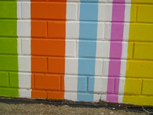
Back then, it was a pretty safe bet that, once she unwrapped a gift of pink bath towels, a bride could drape them over the towel bar and smile approvingly at the way they coordinated with everything else in the room. At that time, “pink” was universally understood to mean the color of Elmer Fudd’s bald pate. The yellow of the day usually matched that of banana-flavored Bonomo Turkish taffy. Blue was a classic “sky blue” and green was unappetizingly close to the color of pistachio pudding.
But the halcyon days of limited color choices are gone. I found this out a few weeks ago, when I decided to do some springtime sprucing-up of our home. I asked my daughter Grace to stop by the local paint store and pick up some color chips. She returned an hour later with enough cards to fill Martha Stewart’s bathtub.
“I took one of everything they had,” she told me.
I have friends with decorating know-how. They could land an igloo in the pages of House Beautiful. They crave paint chips the way I crave chocolate chips, and what’s more, they know which of those 492 shades of green will best accent the rug.
But when you have the decorating savvy of an egg roll, more color choices mean higher anxiety, and a higher likelihood that the entire house will wind up … Classic White.
Fortunately, though, I have recently reached that mid-life point where meek women do uncharacteristically daring things like take up barefoot skiing. I felt empowered. I seized the paint chips and began my personal adventure.
The first chip I looked at was “Interactive Cream.” The color appealed to me, as it was similar to that of a White Russian -- a lovely little drink composed of vodka, Kahlua, and cream. But I had to wonder why the standard designations of light, medium, and dark were inadequate in pinpointing the small variances in the color “cream.” How many shades of cream could there possibly be?
And what made this particular shade “interactive,” anyway? Maybe the more Kahlua and vodka you added to your cream, the more interactive you became with your paint. “Talking to the walls” could take on a whole new meaning.
Believe it or not, “Interactive Cream” was one of the more sensible color names. Pity the poor bridal shower invitee who might be expected to work with these helpful tips:
Kitchen – Dragon Fruit
Bathroom – Inner Child
Bedroom – Nervy Hue
Living Room – Synergy
I’d imagined that my foray into interior decorating would be like stepping into the opening sequence from the old “Disney’s Wonderful World of Color” television show. Instead, the experience put me into a blue funk — pardon me, a “Briny” funk — from which no “Humorous Green” or “Comical Coral” could pull me.
There are no limits to the color palette of God’s creation, but I found out there were indeed limits to my own capacity for picking through them in search of the perfect hue. Call me an old fuddy-duddy (my kids do), but I happen to think there’s value in keeping things simple. When it comes to interior design, I’ll let wilder women go chasing the fleeting, fashionable trends, and I’ll stick to the basics. That’s where I’m sure to find my old favorites: peace and contentment.
In the end, as mid-life crises go, my trial of the colors was not so terrible after all. I came away with a thrilling sense of accomplishment. My goal was to paint the entire house, both inside and out, and I did exactly that.
I think I did a pretty good job, and you’re welcome to come and see it. You’ll find my house easily enough. It’s the one in Classic White.
Copyright 2011 Celeste Behe
About the Author

Guest
We welcome guest contributors who graciously volunteer their writing for our readers. Please support our guest writers by visiting their sites, purchasing their work, and leaving comments to thank them for sharing their gifts here on CatholicMom.com. To inquire about serving as a guest contributor, contact editor@CatholicMom.com.


.png?width=1806&height=731&name=CatholicMom_hcfm_logo1_pos_871c_2728c%20(002).png)
Comments