Bloggers: at the most fundamental level, how does a reader interact with the design of a blog page, as seen on a computer?
I posed this question during a talk I gave at a recent blogging conference. The answer I gave my colleagues was the same answer my journalism teacher gave me, many moons ago:
The “Z.”
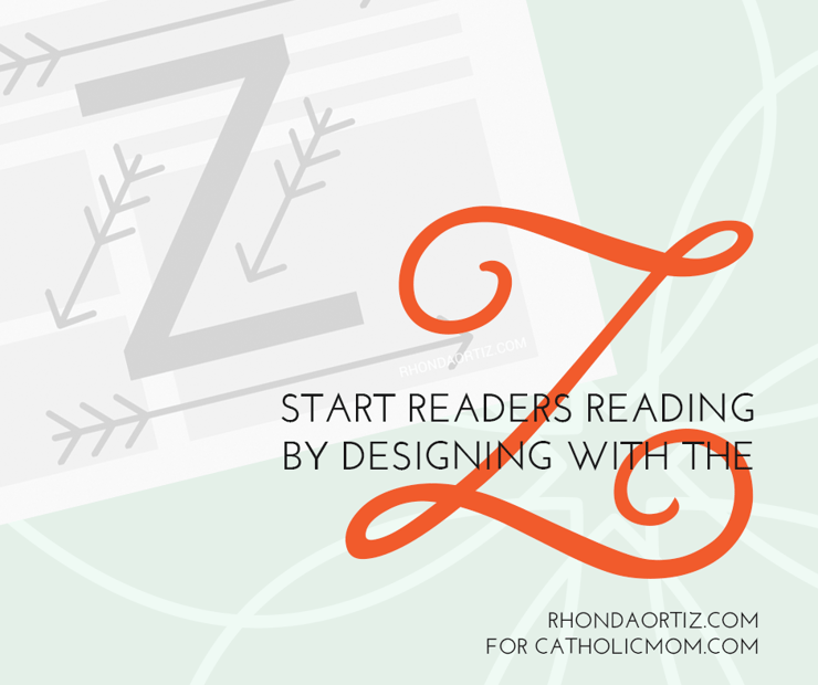
When first looking at any sort of design spread, be that newspaper, magazine, or a website “above the fold” (i.e. what we see when it first loads), the reader's eye automatically glances across the page in a Z pattern.
The eye begins at the top left corner, scans across the top to the top right corner, then shifts diagonally down to the bottom left corner, then sweeps across the page to the bottom right corner.
(Reverse the Z for anyone reading Hebrew or Arabic. But for those of us reading left to right, the above principle holds.)
This happens in half a second. It’s a reflex, but an important one. In that half a second, the reader judges the blog’s genre, content, and level of professionalism. The reader also decides whether or not to keep reading.
Knowing this, we want to work with the Z in order to draw in a busy, distracted reader to noticing, caring about, and actually reading our awesome, awesome content.
How Do We Work With the Z?
The answer is layout: sidebar placement, banner and logo placement, navigation, and the placement of other design elements. We must place design elements in such a way as to facilitate the eye’s path along the Z rather than fighting against it.
A site’s strongest graphic elements should be placed at the strong points of the Z: the corners and along the horizontal paths. The left-hand corners are stronger than the right-hand corners, as the eye’s strength peters out as it reaches the end of a page.
Most important, we want that awesome content---particularly the post title---to be placed in line with this Z that the eye automatically scans it.
Let’s take this screenshot from Goins, Writer:
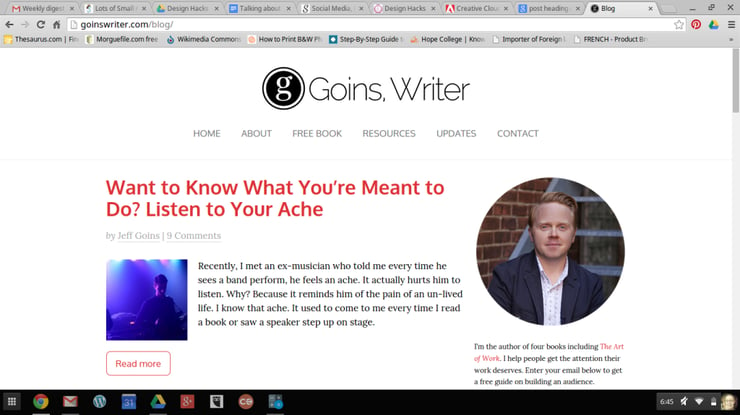
Jeff Goins’ blog has a very simple design: banner, posts on left, banner on right. Nothing splashy, artsy, or cutesy; his blog isn’t aimed at garnering pins on Pinterest. He writes for writers and readers, and his blog design facilitates his “text-heavy” focus.
But just because his blog is “text-heavy” and minimalist in its design doesn’t mean the blog doesn’t have a design.
Oh, no, no, no, no, no. It is very well designed. Check out the Z:
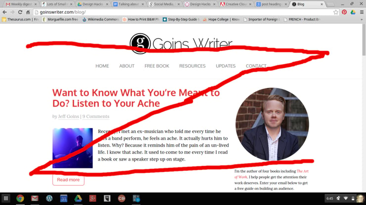
The first swipe of the Z? A clean, straightforward banner, with its modern font and that “g” icon that’s reminiscent of a typewriter key without being a typewriter key. Brilliant. Jeff’s banner gives the reader an immediate impression of his being a classy guy who is also in touch with current trends.
Moving down across the page back to the left-hand corner, our eyes cross over the post title---in red---to the thumbnail image. This blog design places his awesome content at the second strongest point in the Z---the bottom left-hand corner---because getting us to read his content is his top priority.
Finally, the eye scans across the page to the final point of the Z, where we see a final strong graphic element: Jeff’s mug shot.
This is the Z at work---even in a text-heavy, minimal-design, and "man-oriented” genre. This design works with the eye’s natural inclination in order to place a strong emphasis on his content.
Now how about an artsier blog? The family-personal-literary-DIYish-faith blog?
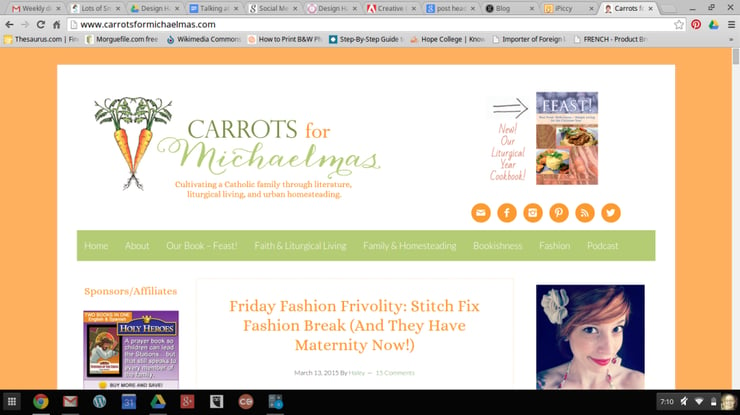
(It’s hard for me to place Haley Stewart’s blog in a strict genre. Family-personal-literary-DIYish-faith it is.)
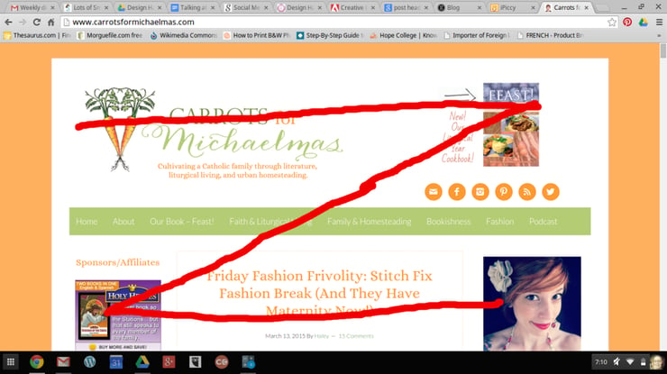
Here, too, we have the Z at play above the fold. At the strongest point of the page, the top left-hand corner, is her amazing banner that perfectly captures the blog’s genre and blogger’s personality: vibrant, feminine, intelligent, creative.
Sweep across to the top right-hand corner for an advertisement for her book.
Bottom left-hand corner is an ad (and that’s quite the money spot---the second strongest on the page!).
Sweep back across to the right-hand corner for a fun mug shot. Sandwiched along that final sweep is her post title in orange.
The Z, to perfection. And beautiful to boot!
But remember: a blog’s primary goal is to get the reader reading. Actually reading. Great graphic elements working with the Z cannot achieve this alone.
You’ll note that the post titles in both of these blogs are neither vague, short, or boring. On the contrary, these post titles intrigue us and promise great things to come.
It’s vital that you write smashing post titles. Hit it out of the park, every time. What’s the point of working the Z pattern if your post title is a dud?
Only great content gets readers reading. Graphic design enhances great content but cannot replace it.
To sum up:
- Get readers interested in your content by facilitating the eye’s natural path across the page, following the Z pattern.
- Frame your post title and content within this Z so that the reader scans your content of his or her own accord.
- Make sure your blog design matches your blog genre. Text-heavy blogs should have a simple, uncomplicated design. DIY blogs should focus on pinnable images. And so on.
- Write awesome post titles.
Doable? I hope so!
Copyright 2015 Rhonda Ortiz.
Images copyright 2015 Rhonda Ortiz.
This article first appeared at rhondaortiz.com.
About the Author


Comments